Iwan Baan in Taipei

This time the most-wanted architecture photographer Iwan Baan travels to Taipeh where he and his wife wander around in Toyo Ito's building.


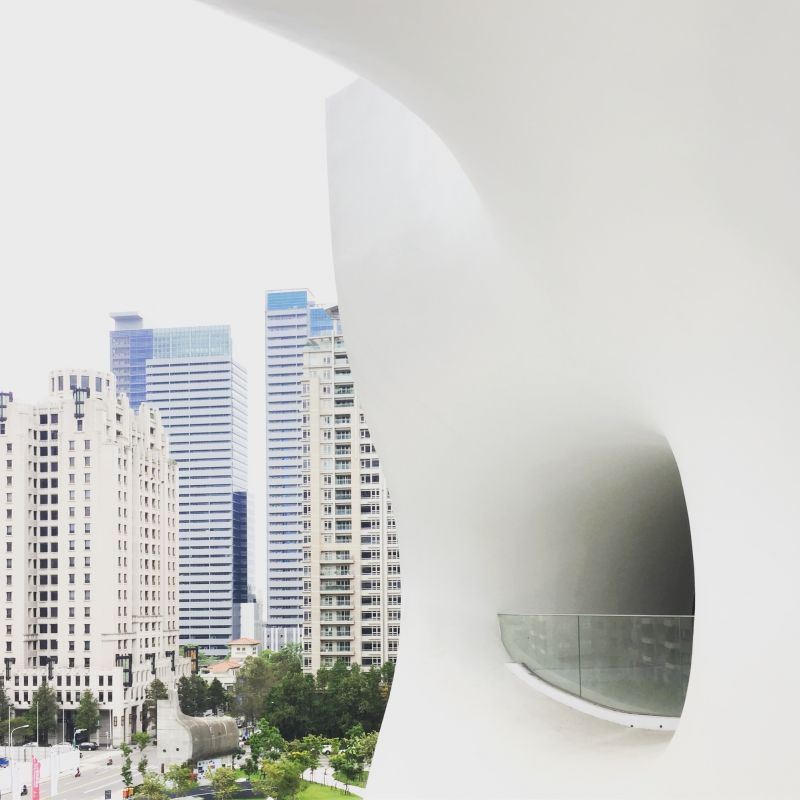
As we walk around what Ito-san describes as a “white-cave”, both Iwan and I can’t help but feel this sort of sensual, human-element in the architecture. There are no straight lines, and no distinction between floor, wall and ceiling.

Toyo Ito has said that similarly to how the human body contains many tube-like organs, the interior of his recently completed National Taichung Theatre is penetrated horizontally and vertically by tubular spaces, and that inside and outside are continuous, just like how our bodies are connected to nature through organs like our mouth, nose and ears. 

Ten years ago, a supportive central government and city mayor initiated the theatre project. The government at the time nurtured Ito’s radical approach to design and construction and encouraged a sort of collaborative and innovative environment. Architecturally complex and highly challenging from an engineering perspective, the theatre was built without beams or columns, relying instead on 58 curved wall units and a whole lot of support from the local municipality.

It was their collective vision that the theatre would serve as a future landmark not just in Taiwan, but also in the world. Perhaps it would fall in footsteps of the Sydney Opera House, which, despite its increased need for funding and extended construction time has come to be a great national and global landmark.


But, the problem with a long-term public project is that the city will see many iterations of government. Some will come into office and see the value of great design and architecture, while other, like the current local government, simply won’t share the vision of creating an experimental and revolution landmark for the city.

So while Ito has created this remarkable, unchangeable structural framework, it seems that the current client simply doesn’t get what they’ve got. So they dress up the architecture in a clumsy costume in order to make it more ordinary, less interesting and easier to use.

Ito’s amorphous walls (that were meant to question mainstream ways of using and thinking about public space) are hacked with cheap and temporary pieces of furniture (sloped floors are made straight with temporary steps, open, breathtaking moments in the architecture are filled to the brim with cheap knock-offs, awkward shop stands and faux Louis XIV antiques.

Luckily, these aesthetic setbacks are shallow: merely a thin veneer decorated across Ito’s incredible feat of engineering. It’s our hope that the right client will soon come around, and peel away these superficial layers. But for now, we have to peer through the disguise in order to see the true greatness of the piece.


By Iwan Baan